How to make thumbnails readable on small screens
Use text hierarchy, contrast, safe margins, real background images, and export checks to make a thumbnail work beyond the editor preview.
Test record and current workspace
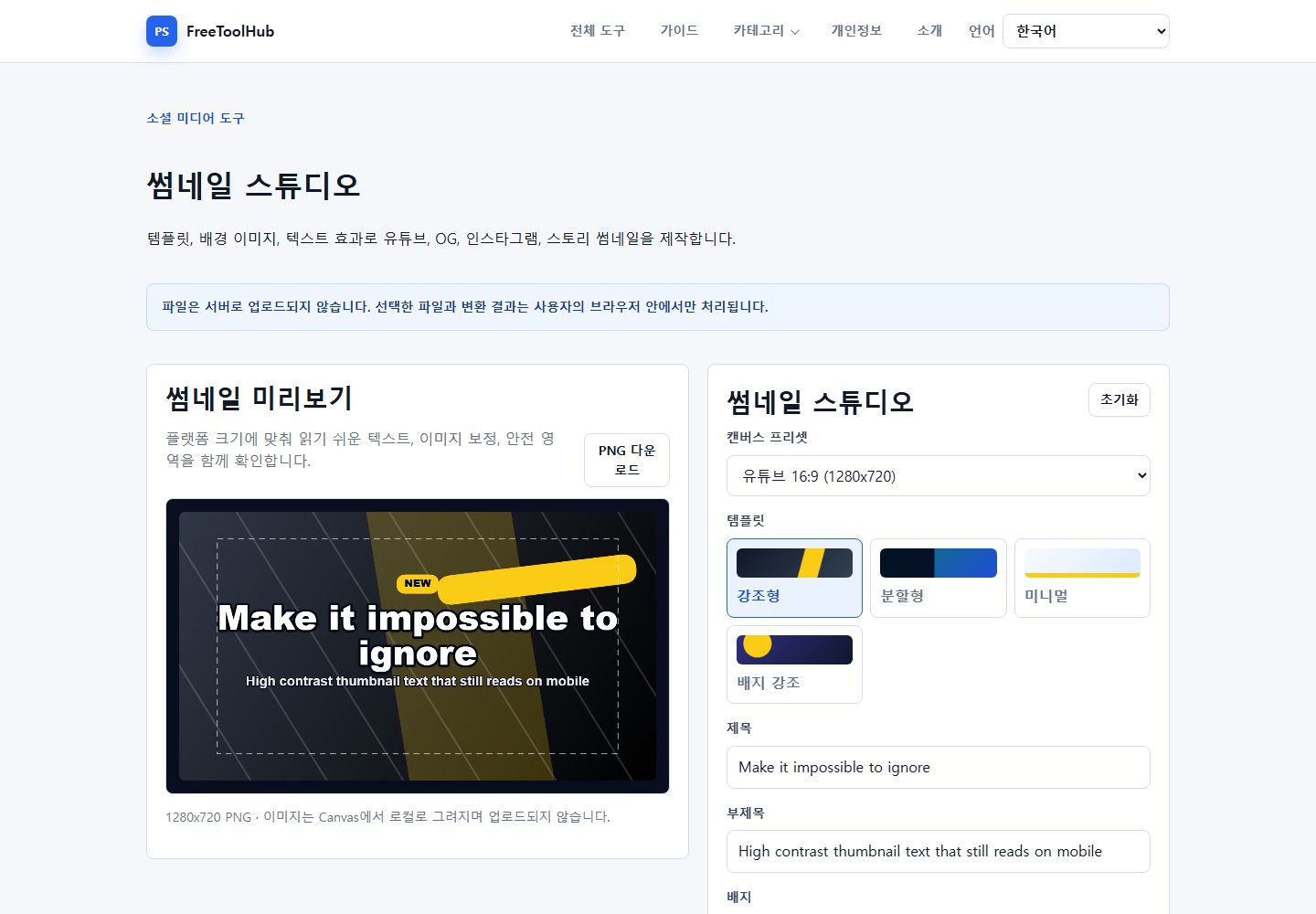
This is a capture of the published workspace used for the guide. The record below separates what was tested, what was observed, and what still depends on the browser or device.
- Test environment
- Chrome 126+ · Windows 11 · Canvas 1280 × 720
- Test case
- mobile preview · contrast · safe area · export
- Observed result
- The studio exposes platform presets, four visual templates, title and subtitle controls, a safe-area preview, and local 1280×720 PNG export.
- Known limit
- Readability still depends on the final feed crop, device size, background contrast, font metrics, and platform recompression.
Write for a small preview
A thumbnail is often viewed at a fraction of its editing size. Use one clear promise, a short supporting line only when needed, and a visual subject that remains identifiable.
- Keep the main phrase short.
- Avoid paragraphs and repeated labels.
- Use a single dominant focal point.
- Check the design at actual feed size.
Protect contrast and safe margins
Text needs contrast against every part of the background, not only the average color. Keep important content away from edges where platforms add timestamps or crop the image.
- Use an outline or background plate when the image is busy.
- Do not place key text in the bottom-right corner.
- Keep faces and logos inside the safe area.
- Compare light and dark text styles.
Export and inspect the real file
The final downloaded file can look different after resizing and compression. Open it separately and check both dimensions and readability before publishing.
- Use the target platform preset.
- Inspect the image at 100% and at feed size.
- Check that text is not clipped.
- Keep an editable preset for later revisions.